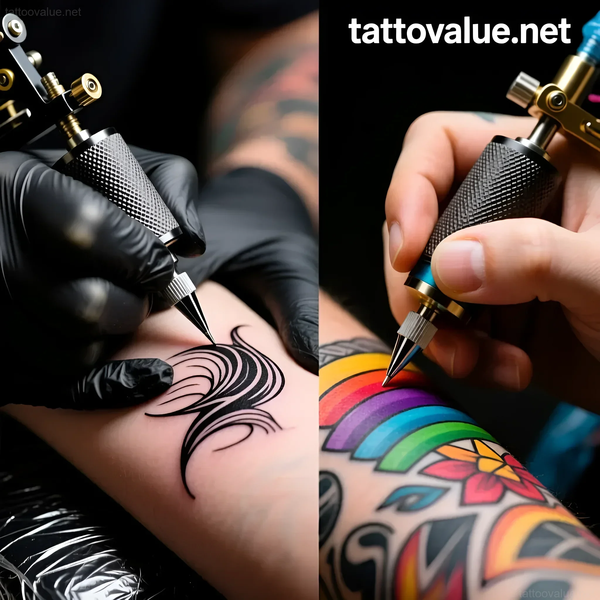
Deciding on your first tattoo is one of the most exciting, yet daunting, personal decisions you will ever make. You’ve settled on the design concept, researched the perfect artist, and now you face the foundational aesthetic dilemma: Should your debut piece be a timeless black & grey masterpiece, or a vibrant, storytelling color explosion?
This choice goes far beyond simple preference. It dictates the art style, the application process, the healing time, and ultimately, how your piece will look decades from now. As professionals at TattooValue, we understand that your first tattoo sets the tone for your entire collection. We’re here to break down the technical, symbolic, and practical differences, ensuring you make a decision that aligns perfectly with your vision and lifestyle.
Black & Grey vs. Color Tattoos: A First-Timer’s Guide to Choosing Your Style

The choice between black & grey (B&G) and color is often the most significant hurdle for a tattoo virgin. It’s not about which style is inherently ‘better,’ but which style best serves your specific design, skin tone, and long-term aesthetic goals. Here is a framework designed to help you analyze your priorities:
1. Evaluating Your Subject Matter
- Black & Grey excels at: Realism (portraits, architecture, natural elements like stone or wood), dark themes (skulls, gothic art), high contrast drama, and designs where texture and light are the primary focus. B&G allows the negative space (your skin) to act as the brightest highlight.
- Color excels at: Narrative clarity, vibrancy, traditional styles (American Traditional, Japanese Irezumi), botanical pieces where true color representation is essential (flowers, butterflies), and designs requiring immediate visual impact.
2. Assessing Your Skin Tone and Undertones
A crucial factor often overlooked by first-timers is how pigment interacts with melanin. The tattoo exists under your epidermis, meaning the color of your skin acts as a natural filter.
- For Fair Skin: Both B&G and color work exceptionally well. Fair skin allows bright colors (yellows, light blues, pastels) to pop with maximum intensity. B&G contrast is typically sharpest on light skin.
- For Medium to Dark Skin: B&G is a universally flattering choice because the contrast relies on deep blacks and smooth grey washes, which stand out beautifully against rich skin tones. If choosing color, opt for highly saturated, opaque colors like deep reds, magentas, cobalt blue, and rich greens. Lighter colors (pastels, light yellows) often appear muted or muddy.
3. Considering Your Future Collection
Are you planning a single, standalone piece, or the start of a larger project like a full sleeve or backpiece?
- B&G Integration: B&G pieces integrate seamlessly, regardless of the subject matter, provided the artist maintains consistent value and shading techniques. They offer incredible flexibility if you plan to add different subjects over time.
- Color Integration: Building a cohesive color collection requires meticulous planning. You must ensure the chosen palette (e.g., primary colors of the first piece) complements the subsequent pieces to avoid a visually chaotic look.
A Brief History of Black & Grey and Color TattooingUnderstanding the roots of these styles provides context for their aesthetic weight and symbolism.
The Roots of Black & Grey: Contrast and Necessity
Black & Grey tattooing, as we know it today, has distinctly pragmatic origins. It flourished in American prison systems during the 1970s and 80s. Pigments were scarce; artists were limited primarily to India ink diluted with water to create varying shades of grey—the ‘grey wash.’ This necessity birthed a highly sophisticated art form focused entirely on value (the lightness or darkness of a shade) and contrast.
- Evolution: The style became synonymous with Chicano art and culture, often featuring portraits, religious iconography, and detailed lettering. Modern B&G has evolved into hyper-realism, where the goal is to mimic the look of a high-definition photograph using only black ink and skin tone.
- Key Takeaway: B&G is the style of restraint, focus, and technical mastery over light and shadow.
The Vibrancy of Color: Tradition and Impact
Color tattooing is arguably the older tradition globally, but its modern Western popularity stems from two major influences: Japanese Irezumi and American Traditional.
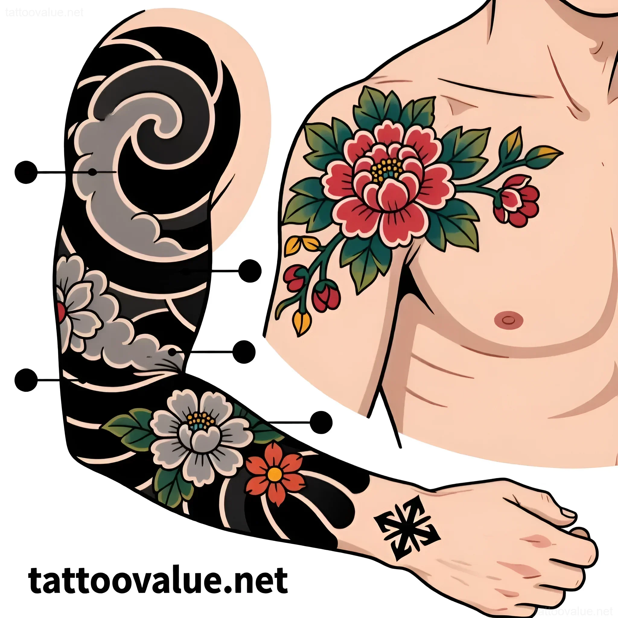
- Japanese Irezumi: Historically, this style used a limited, highly symbolic color palette (black, deep red, green, gold). Colors were not chosen for arbitrary beauty but to convey specific meaning—red for power or life, black for mystery or fate. These pieces are designed to flow with the body, creating a living mural.
- American Traditional (Old School): Pioneered by artists like Sailor Jerry, this style relies on a bold, restricted palette (typically primary colors: red, yellow, blue, green) coupled with heavy black outlines. The colors were chosen for their durability and high visibility, making the design instantly recognizable and long-lasting, even on sailors exposed to the elements.
- Key Takeaway: Color tattooing is the style of immediate impact, emotion, and adherence to narrative tradition.
Decoding the Symbolism: What Do Black & Grey and Color Tattoos Represent?

The style you choose inherently adds a layer of meaning to your tattoo. For a first piece, consider what underlying mood or message you want to convey.
Symbolism of Black & Grey
B&G is generally perceived as more introspective, classic, and timeless. It strips away the distraction of hue, forcing the viewer to focus on the subject’s form and emotional weight.
- Timelessness and Formality: Just as black and white photography holds a classic gravitas, B&G tattoos are often viewed as serious, enduring commitments. They often bypass fleeting trends.
- Introspection and Depth: The use of deep shadows and soft transitions can evoke feelings of mystery, melancholy, or deep contemplation. It’s the perfect choice for commemorating deeply personal, weighted experiences or philosophical concepts.
- Focus on Detail and Texture: Without color, the artist must rely entirely on shading techniques to convey texture—whether it’s the smoothness of skin in a portrait or the rough grain of wood. This level of technical focus often symbolizes meticulousness and artistry.
Symbolism of Color Tattoos
Color speaks immediately to emotion, energy, and life. It is the language of narrative and immediate visual appeal.
- Vibrancy and Emotion: Color is used to amplify feeling. A fiery red dragon conveys aggression and power; soft pinks and yellows suggest joy or fragility. If your design is meant to be energetic and expressive, color is unmatched.
- Narrative Clarity: Color helps the viewer instantly distinguish between elements. For example, in a complex nature scene, color separates the green leaves from the brown branches and the blue sky, making the story easy to read.
- Cultural Adherence: Many traditional designs must be in color to retain their meaning. A traditional Japanese koi fish requires specific colors (often red and black or white and black) to symbolize specific life journeys or characteristics.
Technical Differences: How Black & Grey and Color Tattoos Are Applied

The application process varies significantly between the two styles, impacting session length, artist choice, and healing.
Black & Grey Application: Mastery of Value
B&G artists are often called ‘value artists.’ Their challenge is creating the illusion of depth using only one pigment (black) diluted to various degrees. The process is characterized by:
- Needle Groupings: Often uses large magnum groupings for smooth shading (washes) and tight liners for detail work.
- The Wash: The grey wash is crucial. Artists prepare multiple cups of diluted black ink (e.g., 20%, 40%, 60%, 80%) to achieve smooth, gradient transitions. A good B&G tattoo should look seamless, without visible lines where one shade of grey meets the next.
- Negative Space: B&G relies heavily on the untouched skin to represent the brightest highlights. The artist must know exactly when to stop shading to preserve this contrast.
Color Application: Saturation and Color Theory
Color tattooing requires a deeper understanding of color theory (how colors interact) and significantly more pigment packing.
- Saturation is Key: Unlike B&G, where the goal is blending, color tattooing requires high saturation—packing the ink densely into the dermis so that the color remains vibrant after healing. This often means running the needle over the same area multiple times.
- Layering and Hue Blending: Artists may layer colors or blend hues while tattooing to create custom shades or smooth transitions (e.g., blending blue into green). This process is meticulous and time-consuming.
- Outlining: Styles like American Traditional and Neo-Traditional rely on heavy black outlines to contain the color and ensure the design retains its structure as the pigment ages.
Best Placement Options for Black & Grey and Color Tattoos – Where Will Your Art Shine?The location of your first tattoo should also inform your style choice, particularly regarding visibility and the natural curvature of the body.
Black & Grey Placement Advantages
B&G is highly versatile and works well in areas that require high definition or large, flowing compositions.
- Ideal for Large Areas: Full sleeves, backpieces, and rib cages are excellent canvases for B&G realism. The subtle shifts in value create a sense of movement and drama across the large expanse of skin.
- Intricate Detail Work: B&G micro-realism (tiny, highly detailed tattoos) is immensely popular because the lack of thick color outlines allows for incredible precision in small spaces (e.g., behind the ear, on the wrist).
- Areas with Less Sun Exposure: While all tattoos need sun protection, B&G is less prone to the rapid fading caused by UV light compared to lighter color pigments.
Color Placement Advantages
Color needs light to truly shine and works best in areas where the skin is relatively flat and receives good visibility.
- High Visibility Zones: Forearms, calves, and shoulders are perfect for high-impact color pieces (Traditional, Neo-Traditional) that demand attention. The colors are seen clearly in daylight.
- Areas with Good Blood Flow: Color packing requires deep saturation. Areas with robust circulation often heal color tattoos better (e.g., outer arm).
- Not Ideal for Areas Prone to Friction: While not a strict rule, color pieces on hands or feet may require more frequent touch-ups due to the rapid cell turnover and friction, particularly if they include light, delicate colors.
Practical Considerations: Pain, Healing, and Longevity

For a first-timer, practical concerns about the physical experience and the long-term maintenance of the art are paramount.
Pain and Session Time
While pain tolerance is subjective, the process of applying color versus B&G differs, potentially affecting discomfort levels.
| Factor | Black & Grey | Color |
|---|---|---|
| Pigment Density | Relies on grey wash (less dense pigment). | Requires heavy packing and saturation (denser pigment). |
| Needle Passes | Fewer passes needed for soft blending. | Multiple passes often necessary to achieve opaque color saturation. |
| Discomfort Level | Generally perceived as slightly less traumatic than heavy color packing. | The act of saturation can lead to higher localized discomfort and skin trauma. |
Healing and Aftercare
The healing process is generally similar, but the intensity of the trauma can vary.
- Color Healing: Due to the saturation required, color pieces often involve more swelling and redness immediately following the session. They may also scab slightly heavier than light B&G washes.
- B&G Healing: Typically heals very smoothly. The lighter grey washes often heal quickly with minimal scabbing, provided the artist uses a light hand.
Longevity and Fading
This is arguably the most critical long-term difference. How will your tattoo look in 10 or 20 years?
- Black & Grey Longevity: Black ink is the most stable and enduring pigment available. B&G tattoos age exceptionally well. While the washes may soften slightly, the contrast between the deep blacks and the skin tone remains clear, preserving the definition. They require fewer touch-ups.
- Color Longevity: Color pigments, particularly yellows, oranges, whites, and light blues, are more susceptible to breaking down under UV light. While modern pigments are vastly improved, color tattoos will soften and fade faster than B&G. They often require a color boost (touch-up) every 5-10 years to restore vibrancy, especially if frequently exposed to the sun.
Popular Design Variations: Black & Grey vs. Color – Inspiration for Your First TattooTo help visualize your choice, consider how common first-time concepts translate into each style.
Black & Grey Style Inspiration
- Photorealistic Portraiture: The gold standard for B&G. Human and animal portraits require the subtle depth and shadow only B&G can provide to look truly lifelike.
- Dark Surrealism/Gothic Art: Subjects like skulls, ravens, clockwork, or detailed architecture thrive in B&G, where the focus is on mood, atmosphere, and deep contrast.
- Fineline/Micro-Tattooing: Delicate floral outlines, subtle geometric patterns, or tiny script often look cleaner and more refined when executed in fine line black ink, avoiding the visual weight of color packing.
- Geometric/Mandala: Complex patterns and sacred geometry rely on perfect symmetry and sharp, clean lines—qualities maximized by precise black work.
Color Style Inspiration
- Neo-Traditional: This style blends the bold outlines of Traditional with detailed color blending and modern realism. Ideal for animals (e.g., foxes, owls), ornate feminine portraits, and detailed flora. The color choice is central to the design’s dramatic impact.
- Traditional (Old School): If you want a classic, enduring look—anchors, roses, pin-ups, daggers—this style demands a bold, limited color palette. The colors are intentionally flat and saturated for maximum pop.
- Japanese Irezumi: Designs like dragons, phoenixes, or waves are inherently tied to color symbolism. A Japanese piece without its signature red, green, or deep blue loses much of its cultural weight and visual flow.
- Watercolor/Brushstroke: This style relies entirely on the translucent blending of multiple colors to mimic paint on canvas. It cannot exist without a wide color spectrum.
Frequently Asked Questions (FAQ) – Black & Grey vs. Color Tattoos

Is a color tattoo more expensive than a black & grey tattoo?
Generally, yes. Color tattoos often require more time, a broader range of high-quality pigments, and necessitate multiple passes to achieve proper saturation. If a piece requires custom color mixing or highly detailed blending, the artist’s hourly rate for a color piece might reflect the increased complexity and material cost.
Can I easily cover up a black & grey tattoo later?
It is significantly easier to cover up a B&G tattoo than a color tattoo. Black ink is the strongest pigment. If you decide to cover a B&G piece, the new design (whether B&G or color) can utilize the existing dark areas as shadows in the cover-up. Covering saturated color requires laser removal first or using extremely dark, dense black ink.
If I start with B&G, can I add color later?
While technically possible, it is rarely advisable unless the original B&G piece was specifically designed with color addition in mind. Adding light colors (like yellow or white) over existing grey wash can result in a muddy appearance. If you think you might want color later, discuss this with your artist, who can use a lighter grey wash and leave strategic negative space for future pigment packing.
Which style is better for small, hidden tattoos?
For small, subtle pieces, black & grey (specifically fineline black) is often superior. It offers clarity and detail without the visual crowding that heavy color saturation can introduce into a small area. Color typically needs space to breathe and show its vibrancy.
Interesting Facts: The Evolution and Future of Tattoo Styles
The ongoing development of tattoo technology continues to blur the lines between these two classic styles, offering new possibilities for first-time collectors.
The Rise of Opaque Grey
Historically, B&G relied on diluted black ink (the ‘wash’). Modern B&G artists now often use opaque grey inks—pre-mixed pigments that include white—to achieve brighter highlights and a creamier, more consistent look. This technique, often called ‘opaque grey,’ allows B&G to achieve a depth that rivals color realism without using true color pigments.
Hybrid Styles: The Best of Both Worlds
Many contemporary artists specialize in hybrid styles that integrate elements of both. For example, ‘Blackwork with a Pop of Color’ uses almost entirely B&G, but strategically employs one or two specific colors (like red or electric blue) in key areas to draw the eye. This provides the durability and classic look of B&G while using color sparingly for high impact, making it an excellent compromise for a first piece.
The Impact of Vegan Pigments
The quality and safety of color inks have drastically improved. Modern pigments are often vegan, brighter, and hold their hue better over time. This technological advance makes the longevity argument against color less pronounced than it was even a decade ago, though proper sun protection remains non-negotiable.
Ultimately, your first tattoo should be a reflection of your personal journey and aesthetic vision. Whether you choose the timeless gravity of black & grey or the expressive energy of color, ensure you select an artist whose portfolio demonstrates mastery in your chosen style. This choice is the beginning of a beautiful, indelible story.