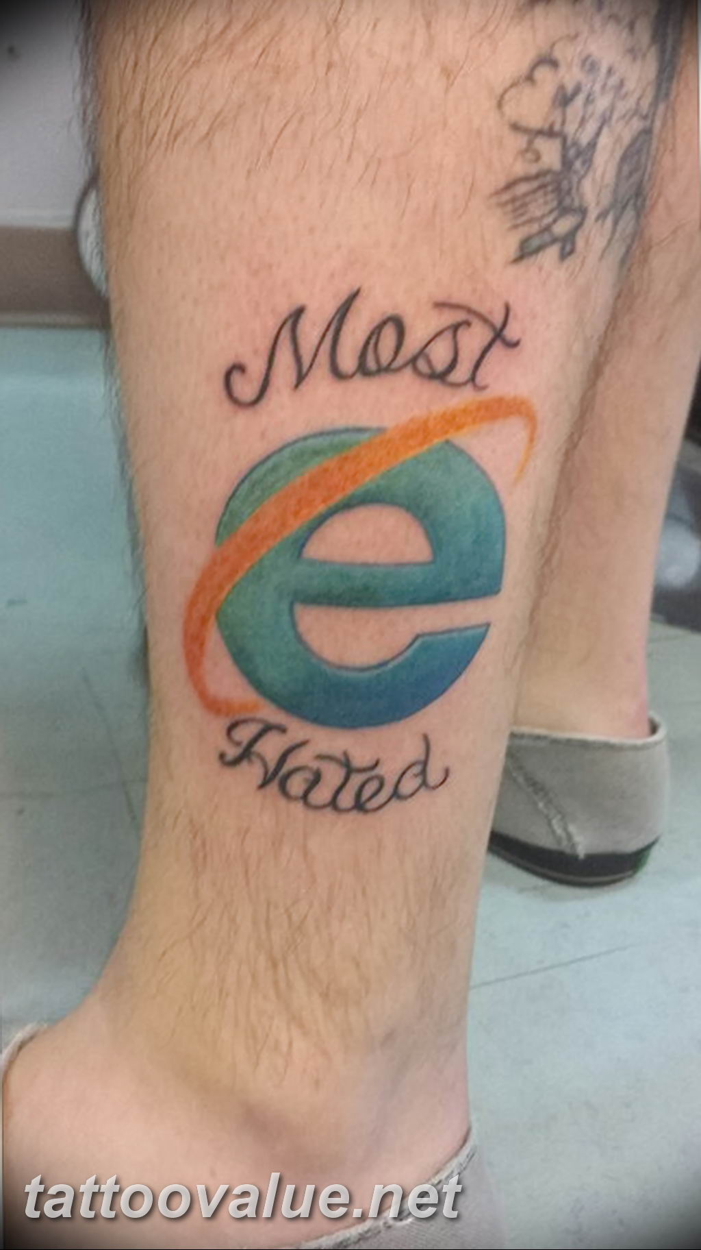
tattoo on the subject of the Internet 24.12.2018 №014 – tattoo internet – tattoovalue.net
Visual Analysis of the Tattoo
This tattoo is a tongue-in-cheek commentary on the widely criticized web browser, Internet Explorer. The design features the iconic ‘e’ logo rendered in its classic colors, accompanied by the phrase ‘Most Hated’ above and below. The composition is straightforward and direct, with the logo and text prominently displayed. The color palette accurately replicates the original logo’s hues of blue, orange, and green. Shading is minimal, emphasizing the flat, graphic nature of the design. The focal point is undeniably the Internet Explorer logo itself, instantly recognizable to anyone familiar with the internet. The placement on the calf allows for a clear display of this humorous statement.
Artistic Style and Technical Execution
The style is simple and graphic, prioritizing accurate replication of the logo. The execution requires precise color matching and clean lines to maintain the logo’s recognizable form. A skilled tattoo artist will ensure that the colors are saturated and evenly distributed.
Symbolism and Cultural Significance
Internet Explorer was once the dominant web browser, but it has become notorious for its slow performance, security vulnerabilities, and outdated technology. This tattoo likely represents the wearer’s frustration with the browser, their sense of humor, or their participation in the online community’s shared critique of Internet Explorer.
Explore More at tattoovalue.net
Discover the fascinating world of tattoo art and symbolism! Explore our articles about tattoos for in-depth analysis. You can also find inspiration for your next ink idea by browsing our tattoo sketches.
